|
By Rick Levine
My brother Neil
approached me for pointers about selling on the web. He's an overly
competent Bay Area hat designer, and wanted to break out of his normal retail
fashion haunts. Could I do a web site to sell hats? The bad news about hats
is that people shop for them by trying them on. Other than inventing a new
class of computer peripheral, would it be possible to create a web site that
gave people a sense of the fun, the whimsy and the "out-there-ness"
they could get from wearing his hats? And, the site has to be easy enough
for our parents to use, as it's the aging boomers and relatives of kids who
are his mainstream hat clientele. Oh, yeah, and people have to be able
to send hats to kids living in several locations with one purchase, with gift
cards, because this is a gift business. And, not to put too fine a point on it,
the site has to push a brand identity very strongly, as the brand is almost as
important as the product.
My first answer was "No. What are you smoking?" My second was
more optimistic: "Let's see if it's been done already."
We started browsing.
 |
|
|
|
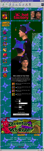
A product page from www.hatfactory.com: the Jester hat.
|
|
We explored thousands of commerce sites. In addition to really sore eyes, we came away
with a strong impression that the field of web storefront design is, er, ripe for
innovation and improvement. We found a decided lack of sites that regard customer care as
a high priority, or take pains to present their product in ways that will entice prospective
buyers to explore their site and learn more about their goods.
This is puzzling, as many of the sites we examined are fielded by companies who know their retail business: the affliction isn't
limited to small companies, or to the growing number of hey-buy-my-whatever amateur
shopping cart sites. Even the big outfits, those with burgeoning catalog
businesses and hundreds of thousands of customers, treat their on-line shoppers to
un-navigable mazes of links, anemic product presentation, and purchase user interfaces
that would get any "real-world" software developer run out of town
on a rail.
My brother's next question: could we do better?
Four months and around 500 person-hours later,
www.hatfactory.com was launched. The site is
intended to be both a stellar small-business ecommerce site, and a testbed for some
of our ideas about how to do a better job at small-shop web retail. The guidelines
in the sidebar are some of the lessons we learned as the site
design evolved, both from looking at lots of good and not-so-good commerce sites,
and from our own experimentation.
Along the way, we covered a lot of ground:
- We had to implement a "stateless" ordering infrastructure allowing customers to jump
around on the site.
At almost all steps in the ordering process, a customer can jump to other site destinations
without being penalized for changing their mind. You can literally fill out a gift card and
jump back to browsing hats without losing the shipping, gift card and address information you've
entered so far.
- We had to design a site architecture that allowed effective presentation
of products while maintaining simple link navigation.
The issues we needed to solve centered around a need to make pages longer
to get more display space for images and text, but not make the pages feel so
long that customers would feel claustrophobic as they scrolled downward. Our solution
includes very clear "escape" navigation links on the top and bottom of the page, an
extended left-side icon navbar that provides an exit while scrolling, and a side-by-side
text and graphics layout that entices both visually- and text-oriented readers to continue
down the page. We're going against some of the conventional wisdom about page length, but
we've gotten very positive feedback, even from scrolling curmudgeons, that the page length
doesn't feel opressive. The overall site architecture is also as "flat" as we
could make it, eliminating the common "maze of twisty little passages" feeling you
get from many hierarchical commerce catalog sites.
- The entire administrative framework for the site runs on the 'net, using secure
form-based interfaces.
This includes page generation and maintenance, SKU and pricing management, customer, sale
and package tracking, and mailing list management. Our philosophy was to use the medium to
manage the business systems. Pages are created from stored templates and SKU and style configuration
data. Repeated HTML code is only written once, and reused.
- We tried to get maximum leverage from the technology envelope.
Some site designers forget that there is a computational and database engine
underpinning everything they do, and they force customers to do the things that computers
are good at. We remember an "address book" for each customer, so they don't need
to re-enter address data. We calculate tax and select shipping options based on addresses.
We don't force people to use cookies if they prefer not to. We integrate real-time credit card
and check acceptance services, and catch common data entry mistakes up front, saving customers and
ourselves time in the order cycle.
Here's a short link tour of the site:
- Start at the top: www.hatfactory.com.
The index page is short, with an easter-egg teaser rollover at the top. We want people to
chuckle and click on a link as quickly as possible, as the front page is just a doorway.
- The polarfleece
product family page shows all the products in the family, has enough substance in the text to catch
the readers in the crowd, and also silently pre-loads all the icons for the subsequent pages.
- Our couture page is a
teaser for our high-style line, to be launched in 1999. It collects email addresses for future
promotion. The email collector tags these names as having specific interest in our couture line,
and does basic error-checking and error prompting on addresses.
- Our hat style pages
(the Jester is shown above in miniature) all follow the same
basic layout, are thoroughly interlinked, and offer a link for more pictures. There's also
a Red Rabbit cartoon
strip running across the bottoms of all the style pages, as a scrolling
inducement. (It'll be updated every month or so. We'll see what it does for us!)
- Our privacy policy is
aimed at being a very deliberate and thorough discussion of what information we collect from you
and what we do with it.
- We've taken a unique approach to ordering help/instructions
as a bit of an experiment. Our testing so far has shown that people react very well to a
"bird's-eye" view of the site as a way to get more comfortable with our ordering process.
- Last, there's a bit of copy about
the business. Suprisingly, this has turned out to be one of the more popular pages on the site.
We hope you enjoy our site, and that this discussion of how we got here is useful. If you have
comments, reactions or questions, please drop us a note.
We answer our mail!
Hat Factory is a small company started by two brothers.
Neil Levine is an artist, illustrator and fashion designer,
living in San Francisco, California. Rick Levine
is a web designer and software architect for Sun Microsystems' Java
Software Division, living in Boulder, Colorado.
Rick and Neil are also
partners in Levine Squared, LLC, a small consulting company doing
innovative commerce site design. Contact them at
levinesquared.com.
|
|
|
Guidelines from the trenches: some lessons we learned on our way
to launching www.hatfactory.com.
|
 |
Show your product. |
|
Many of today's web catalogs don't show their product to consumers. People won't buy what they can't see.
Many e-commerce sites currently use small images and poor quality photography. When offered a chance to click on a
thumbnail image for a larger view, the resulting picture is often only a slightly larger snapshot
of the same thing. Pay for professional photography, show more than one view
of a product, and make the presentation hold its own on the page. Describe the product in text, as well, for
customers who prefer verbal over visual description. |
 |
Know your purpose. |
| |
Before the first line of copy is written, or any coding
begins, know why you're building a commerce site, how it's going to serve your customers, and how the
e-commerce venture fits with the rest of your business.
Understand your business and your goals. Otherwise, the web is a great way to waste lots of time and
lots of money. Be sure you can answer the question "What business are we in?"
|
 |
Entertain. |
| |
If your audience enjoys your site, they're more likely to revisit it,
and to tell others about you. Make your content interesting, engaging, and entertaining, and people
will spend more time with you. Make them laugh. Teach them. Capture their imagination.
|
 |
Give more, take less. |
| |
Give something back to your audience. Consider each
page of the site, and make them a gift of an interesting tidbit of knowledge, an engaging graphic,
or a revelation about themselves or the world. With each page impression, you have the potential
to teach, to illuminate and to inspire. If you take advantage of the opportunities, people will expect more
back, and view more of your pages hunting for more value.
|
 |
Don't make your customer feel like an idiot. |
| |
Bill Cosby had a wonderful
shtick on one of the recordings we listened to when we were kids. It was about accidentally hitting the
windshield wiper switch in a car, and the wipers would flap back and forth saying "dumb guy, dumb guy,
dumb guy," over and over again. All too often, that's what happens to our customers on the web. They follow
vaguely labelled links to unwanted content that could have been clearly marked. They're chastised by "error" messages triggered
by actions they didn't know were wrong.
Design your interfaces to guide people into correct choices, and engineer out
the errors before they make them. They know they're not stupid, and they shouldn't be treated to site design that
makes them wonder if they are.
|
 |
Let your customers do things their way. |
| |
It doesn't matter how you think people "should" use your site. They'll want to choose their
own path, and they'll get very frustrated with you if you don't let them. If I'm adding a gift card for
Cousin Freddie to my completed order and I remember that I should probably buy a present for Aunt Martha,
let me. Make your site "stateless," in the sense that I can stop what I'm doing at any time and
come back to it later. I should be able to choose when and where I give you basic information, and I
should almost always get a second chance.
|
 |
Create trust. |
| |
Make your information hygiene and policies explicit.
Publish a complete statement detailing the information you collect from customers, what you do with
it, and what choices they have concerning their personal information. Don't weasel-word it, don't hedge
and don't be vague.
Once you've published your information policy, stick to it. If you say you're going to delete their
customer record, do it, and don't hold back a copy in case you change your mind. If you say you'll
answer your mail, answer it. If you say you'll only send one piece of mail, send only one. Even cynical
people take your initial assurances at face value, but they notice real quick when you cheat. Don't do it.
|
 |
Sweat the details. |
|
The t-shirt gets it half right: it's all details. People's understanding of the world is shaped as much by little
things as by big things. Usability studies of web sites have shown that people base their judgment of the
veracity and accuracy of a site's content on the fit-and-finish of the site. Spelling, punctuation, grammar,
page layout, readability, image quality, broken links, all have as much impact on your customer's reaction to your site as
the specifics of your product and business. It's not fair, but that's the way peoples' heads work. Spend the time
to make your site as perfect as you can. No excuses.
|
 |
Listen to your customers. |
| |
All too often, sites are created for very small audiences: usually limited to the site design team or the company web
business manager! You are not your customer! Talk to your customers, listen to their responses, and base your
site and business process design on their needs and feedback. Every interaction you have with a customer, whether
by 'phone, email or in person, is an opportunity to discover how well you're serving their needs. Learn to ask the
opening questions that will get them talking, and then shut up and listen. Don't defend, don't explain: just listen.
(And if you have comments on our site, send 'em in: webmaster@hatfactory.com.)
|
| |
 |
Ask for help. |
| |
Of all the lessons we've learned, asking for help at the right time is one of the hardest to internalize.
We try to do too much, and stretch our meager skills too far. Learn what you're good at, and get help with
the rest of the stuff. Even when you're good at something, learn to ask for feedback and criticism from
people equally skilled, so you mitigate the risk of getting too close to your problems and losing objectivity.
|
|